In June of 2013, a friend gave me a beautiful piece of mica and a promise to share what she had learned about using mica in a workshop given by noted artist, Daniel Essig. We met several times to go over her notes and to experiment with materials and book structures.
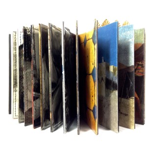
In the end, I decided that I did not want to do a book like the one she had made in Daniel’s class, but rather a “Mabel Dean” book – whatever that turned out to be. I thought about “collections” of things which is what his book-style suggested with many unique papers, pages and windows.
Several years before my husband and I had gone to Morocco and I had taken some photos of people and places. I decided that I would gather my favorite photos from that trip for this book. The concept of using them as an Essig-style “collection” seemed intriguing.
I selected and printed test color photos on plain computer paper. I liked the feel of the photo on the ordinary paper. Some how regular photo paper did not suit my Moroccan pictures. I experimented with finishes on photos printed on various papers and observed how shellac (yellow and white) and Dorland’s wax gave the photos a unique aged feeling especially when the pictures were printed on regular copy paper.
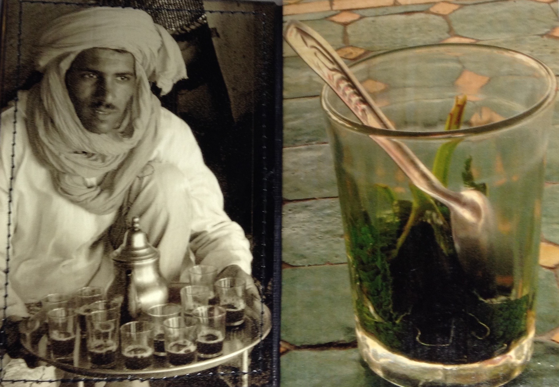
 I thought about how a book of colored photographs, page after page, could become boring. I looked through my files to see what I might use for contrast and found that I had a number of “grab” shots of people that could work in the book. Moroccan people do not like to be photographed, and I still feel a bit guilty that I snapped them when they had not agreed. But I decided to use them in this particular book because it would not be for sale and it will have limited circulation. I believe that my treatment of their photos by printing them in black and white on transparencies, is a way of honoring them and their culture.
 Once I had prepared the photographs – printing, treatments, and mounting on individual pages, I began to explore the kind of book structure to use. After thought and experimentation, I determined that a stiff leaf binding would be the best format.
I found decorative brass metal in my stash, and velvet pink sand from the Sahara desert which I had brought home with me. All of these materials were used to create the covers. Somehow they seemed right for the project. I painted Velin Arches papers so they had a sand-like feel and created a window for the sand. Mica – possibly from the Atlas Mountains – served as the window pane. A scrap of the brass was included along with a cerulean sky to create a Sahara landscape on the inside back cover.
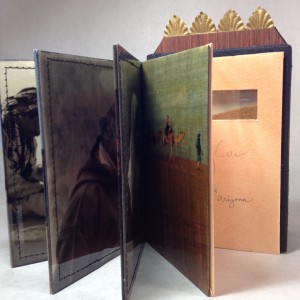
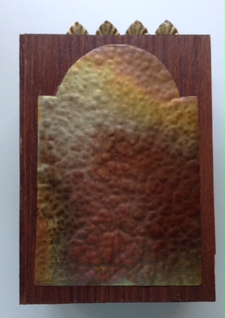
My book was nearing completion. Next I faced the challenge of engineering the book so that it would come together in a cohesive fashion. Integrating all the components of the covers with the structure and maintaining a Moroccan flavor was my goal. I wanted a cover that would reinforce that this was a book about Morocco. I determined that wood would be the appropriate cover material as the covers are like doors into the book. I had some wood veneer that turned out to be just right once it was stained. Adding a brass form to the front cover further suggested the door theme.
 The book is now complete and my memorial to Morocco is in a form that will continue to bring back fond memory of that beautiful country. I feel the end result is definitely a “Mabel Dean” book. As I hold it in my hands I can see the Daniel Essig influences, subtle and sensory.
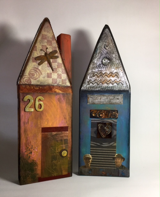 Recently I spent a delightful Saturday with my friend Rose Andreacola and several of her “artsy” friends. She showed us a basic technique for creating simple house sculptures using primed scrap lumber, acrylic paints, stencils, stamps, photo copies, ephemera, and aluminum duct tape (from Home Depot and Lowes) used for making vent seams tight.

